





to do list (Admin only)
⚠️ lesson in EARLY ACCESS ⚠️
Please keep this in mind when viewing this lesson as we still need to do a final pass on it.
Feel free to share anything that is out of place in the feedback form at the bottom of the lesson to help us improve it.
Thanks and happy learning!
LESSON OVERVIEW
In this lesson we're going over some portfolio presentation techniques to improve our chances to get a job. We'll be diving into what makes a good portfolio, what the purpose of your portfolio is and specific tips to improve your presentation for your thumbnails and artworks.
So let's dive into why we even bother with making a portfolio and what it's supposed to do for us artists.
⚠️
Missing LESSON OVERVIEW
WHAT’S THE PURPOSE OF A PORTFOLIO
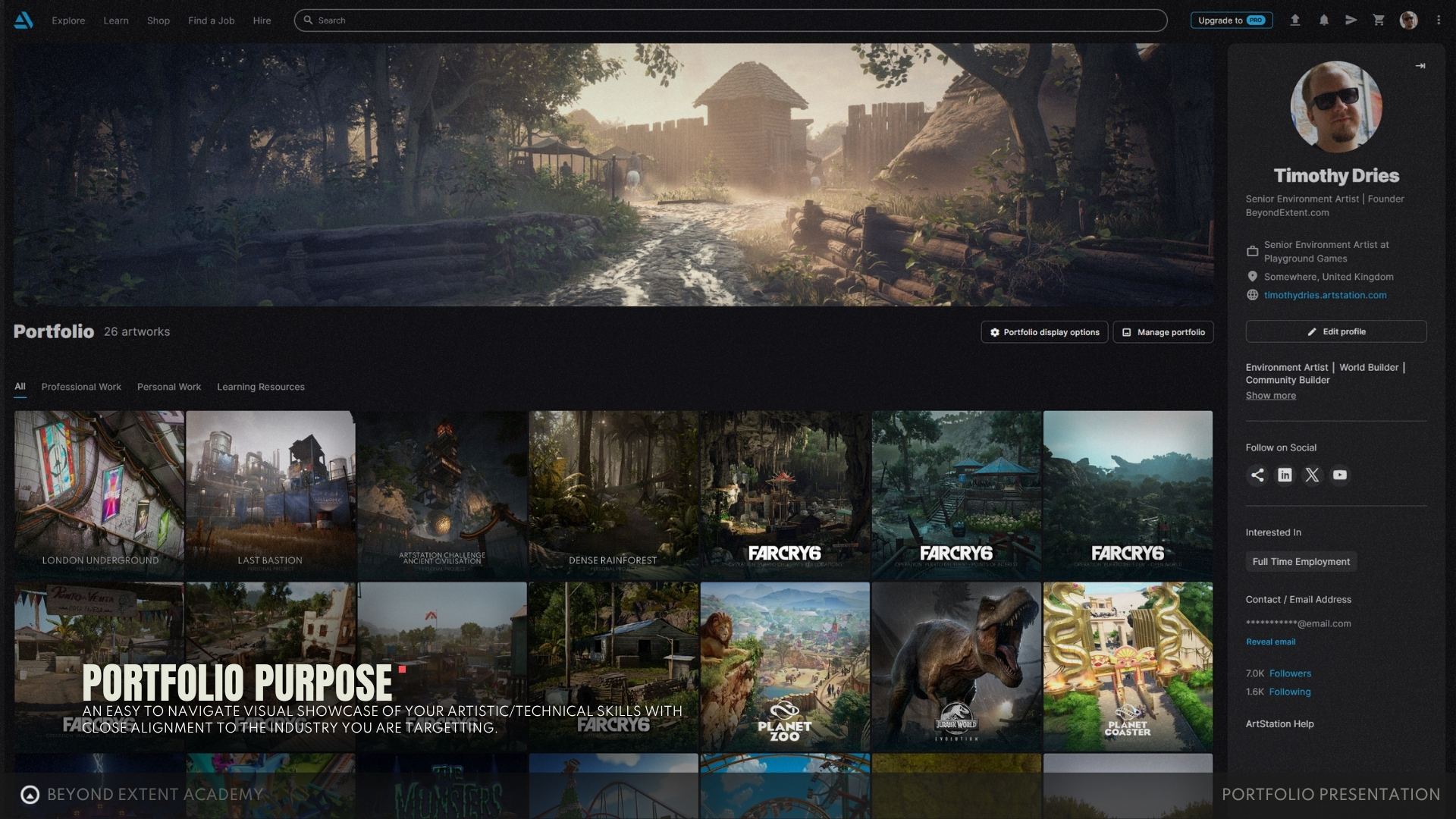
The purpose of your portfolio is to be an easy to navigate visual showcase of your artistic/technical skills and how those align to your target industry. In addition to this your portfolio should be a showcase of what you prefer to do through your work.
For me my personal work was always trying to focus on bigger worlds or spaces rather then individual assets, which is shown through my work. Because even if you showcase a wide range of skills on your portfolio there will always be one skill or type of art that stands out from the others.
General presentation advice
Now that we got the purpose of your portfolio out of the way, Let's start with some overall good advice that can be applied when we present your Artwork. Starting with things I personally recommend you to do.
✅ DO
- Reduce friction/clicks where ever possible
(Every time you ask for a person to click you risk losing them. So optimise for frictionless design, use Autoplay videos, small GIF's and Images where possible, avoid adding clicks or loads of scrolling where possible) - Condense information into a single image/short videos
(Don't have multiple images trying to show the same information, condense it down to a single image, especially for breakdowns) - Keep presentations clean and minimalistic
(Especially if you are unfamiliar with fonts or general design language, if you have knowledge/experience feel free to personalise this more. Recommend to use Sans Serif fonts for readability) - Give proper spacing to your artwork
(Spacing around the edges of the frame and between elements is crucial, we need to give things space to breathe (think about it like your art, add area's of rest and detail areas)) - Pick a readable font that matches the vibes of the project
(This can help enhance the presentation of the work by thinking of all the aspects, not only the work itself, in general recommend any Sans Serif font, but other font types can be used to great effect on certain project styles) - Add your name or contact information to images
(This helps people find you even if your image get saved in other places than your portfolio, but keep it elegant an minimalistic) - Come up with a name for your project
(Something like "Sector 54 - Warehouse" sounds more interesting than "Scifi corridor") - Design a logo for your project
(Optional, but can be fun for people with design background. A fun way to integrate presentation with your style)
⛔ AVOID
- Quick screengrabs or pictures from your phone
(looks lazy and unproffesional, like you didn't have time to do something proper, it's better to have nothing instead of this) - Adding too many images, less is more.
(Comes down to reducing friction and showing intent. If there are 50 images in a single post then most people will not get to the bottom. A post with 5-10 images seems a good number for most posts. Quality over Quantity) - Using Interactive Viewers as your main way to showcase technical details.
(I don't mind people adding them if they are optional, but long loading times means that recruiters will skip this unless they want to see something very specific. Keep in mind that usually people spend a couple of seconds on some posts, so you asking them to wait for that amount of time is not something a lot of people will do) - Avoid thumbnail clutter
(For example Unreal Engine Logo's on your thumbnails are unnecesary in 99% of cases, expect for ones that look like they could not be done in Unreal Engine, but are)
Portfolio design
With some general tips out of the way let's focus on the top level of your portfolio now.
Our goal is simple, as discussed in the first section on PORTFOLIO PURPOSE we want to aim for the highest possible quality, showcasing well designed portfolio that looks professional and shows everyone where you see yourself now and where you want to be.
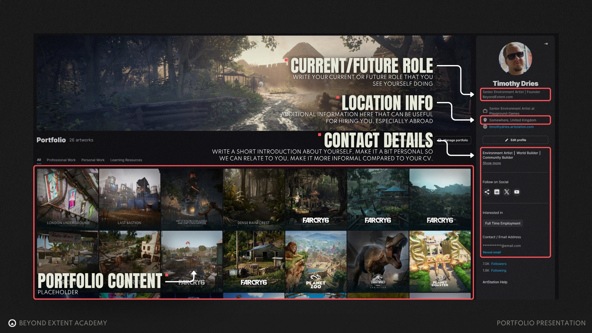
- Current/Future role
What you are doing currently, ifyou have a job in the relevant industry already, or where do you see yourself in the near future. If you are an environment artist in training, feel free to call yourself a Junior Environment Artist. This titles needs to reflect the work you have on your portfolio! If you only make assets, but call yourself an environment artist you will not get any job offere for environment art. - Location Information
Very relevant information for recruiters or studios looking to hire you, knowing where you currently resides helps them make a quicker descision on wether they want to hire you or not. - Contact Details
Make it easy for recruiters to hire you and only add relevant channels that show your professional side, unfortunately adding your personal cooking blog here is not going to be relevant to getting you hired. - Personal Description
Short little description on what makes you the artist that you are today, its okay to be a little bit more informal here. Your professional formal information is all on your CV.
Thumbnail design
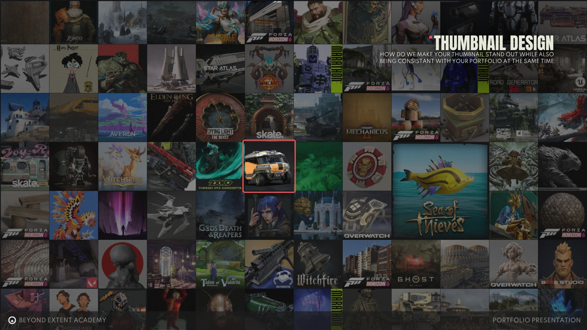
Next we have the individual thumbnails of the artwork. Your thumbnails need to be able to convince anyone to click on it within a split second. Time is precious, and there is a lot that we can already recognise even without clicking on the thumbnail.
As Recruiters or Artists we notice things in a split second, we make an immediate split second judgment on the following:
- Presentation
(Is the presentation well done, has a clear focal point and am I interested in clicking on it?) - Quality
(Is the quality good enough to be considered to get into the industry) - Relevance
(Is the work you show relevant to our industry, for example a AAA recruiter looking at lowpoly flat shaded assets is going to move on quickly)
I really want to highlight this factor again, when someone lands on your page with the intent on hiring you or someone else for their company, they are looking at multiple people (sometimes 100's per day) so you have very limited time to stand out and showcase your work, so thumbnail is massively important.
So with that said, let's dive into how to craft better ones!
crafting a good thumbnail
We want to start by picking an image that showcases a focal point that is easy to recognise and stands out with a nice silhouette and has a nice amount of contrast, using this as a base for the following additional adjustments.
Keep in mind that when we do the following adjustments that we are doing them for two places at the same time, Artstation frontpage and your Personal Portfolio page.
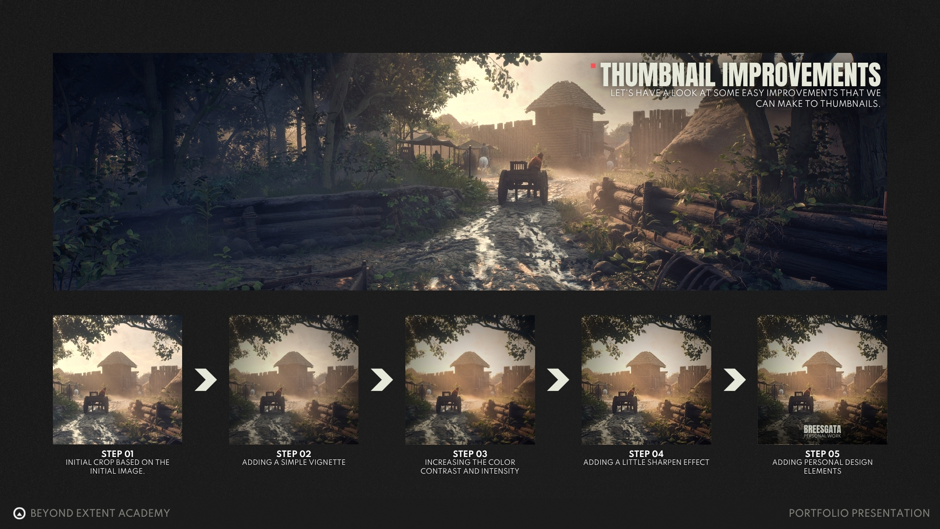
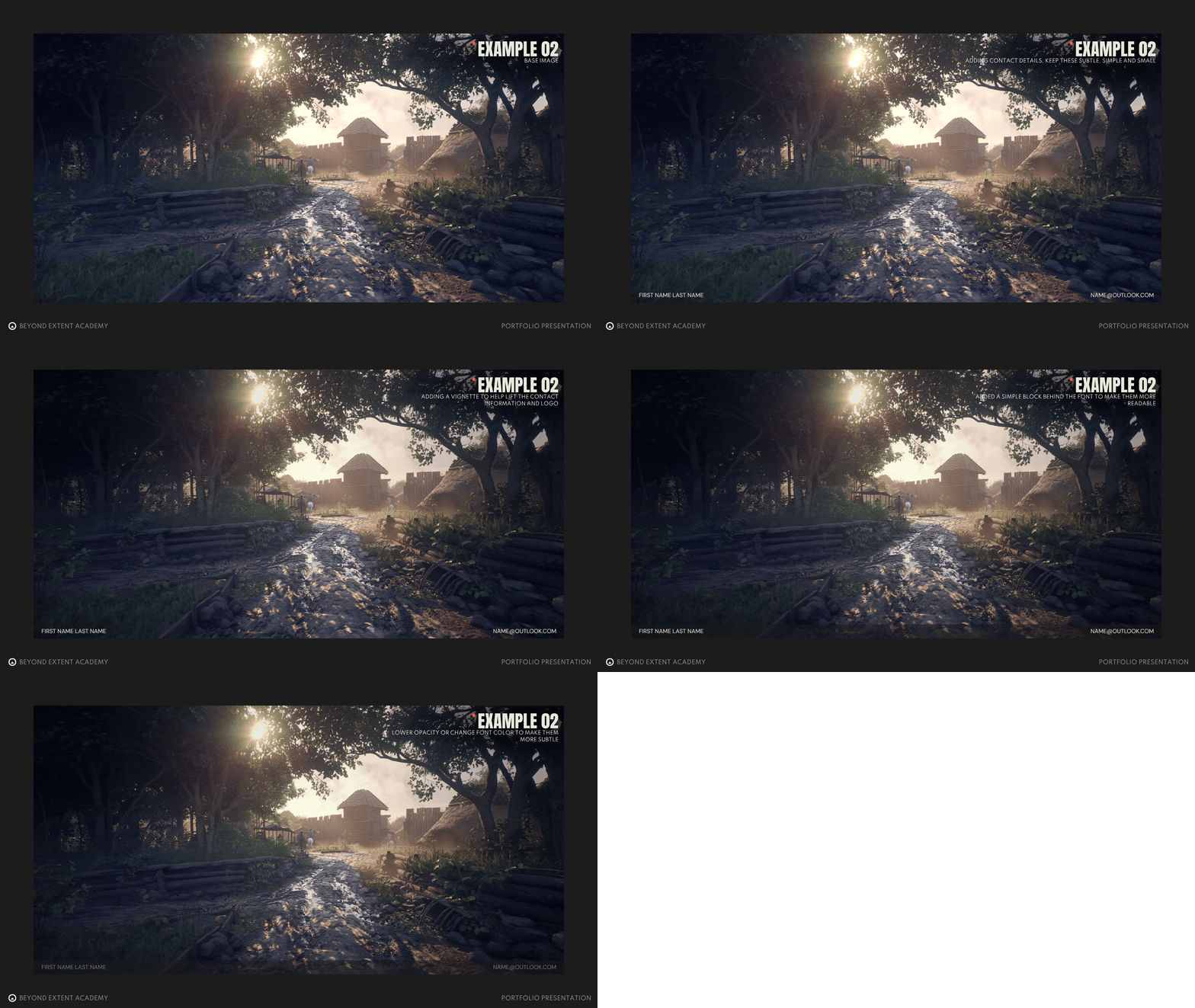
- Initial crop of the original image
- Adding a vignette
- Increase contrast, saturation or other post processing effects
- Adding a sharpening filter
- (optional) Add personal design elements)
⚠️ Some things to avoid ️when making thumbnails
- Thumbnails that feel different from the actual artwork itself
(This creates a weird inconsistancy between the thumbnail and the work itself) - Focus on portfolio consistancy over front page captivity
(Most connections that you will reach out to for applications will land on your portfolio) - Avoid adding unnecesary graphical elements
(We want to let the art speak for itself, so avoid program logo's, arrows, circles, etc...) - Avoid using program logo's
(Only add these if you are required to use them, for example with professional work. Or if you've made some extraordinary that would normally not be made with that program) - Avoid company/game logo's when making Fan art
(Unless they are clearly signaled that it is fan art in the thumbnail itself)
Testing your thumbnails
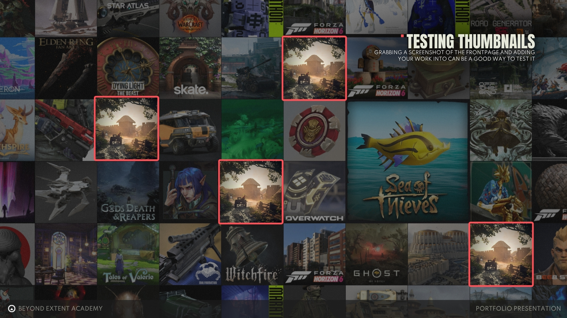
When you've done work on your thumbnails the next stage would be testing the thumbnails, a simple way of doing this is by going to the main page of Artstation, taking a screenshot of the frontpage and then adding your thumbnails into the mix to see which one stand out a little bit better.
Keep in mind that thumbnails are visibile on both places, on the main page and on your personal portfolio page, always prioritise your own portfolio compared to making it purely for the front page.
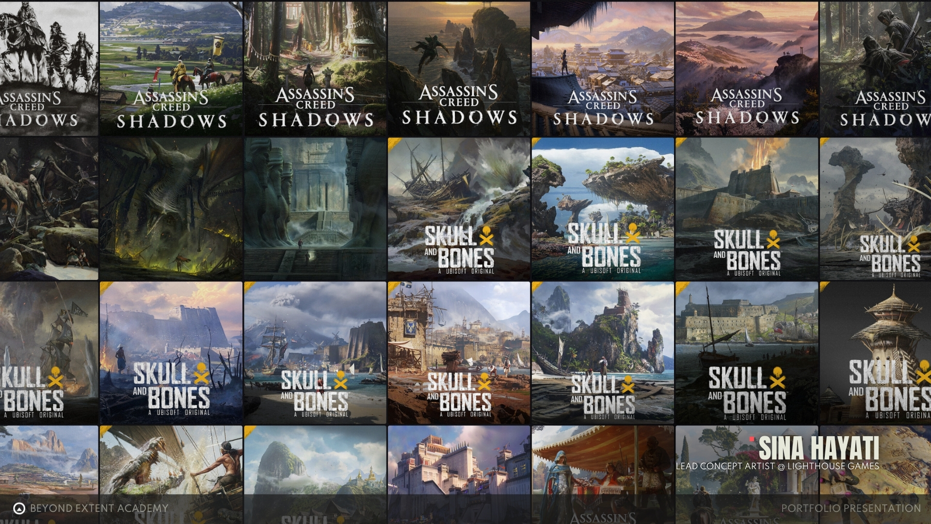
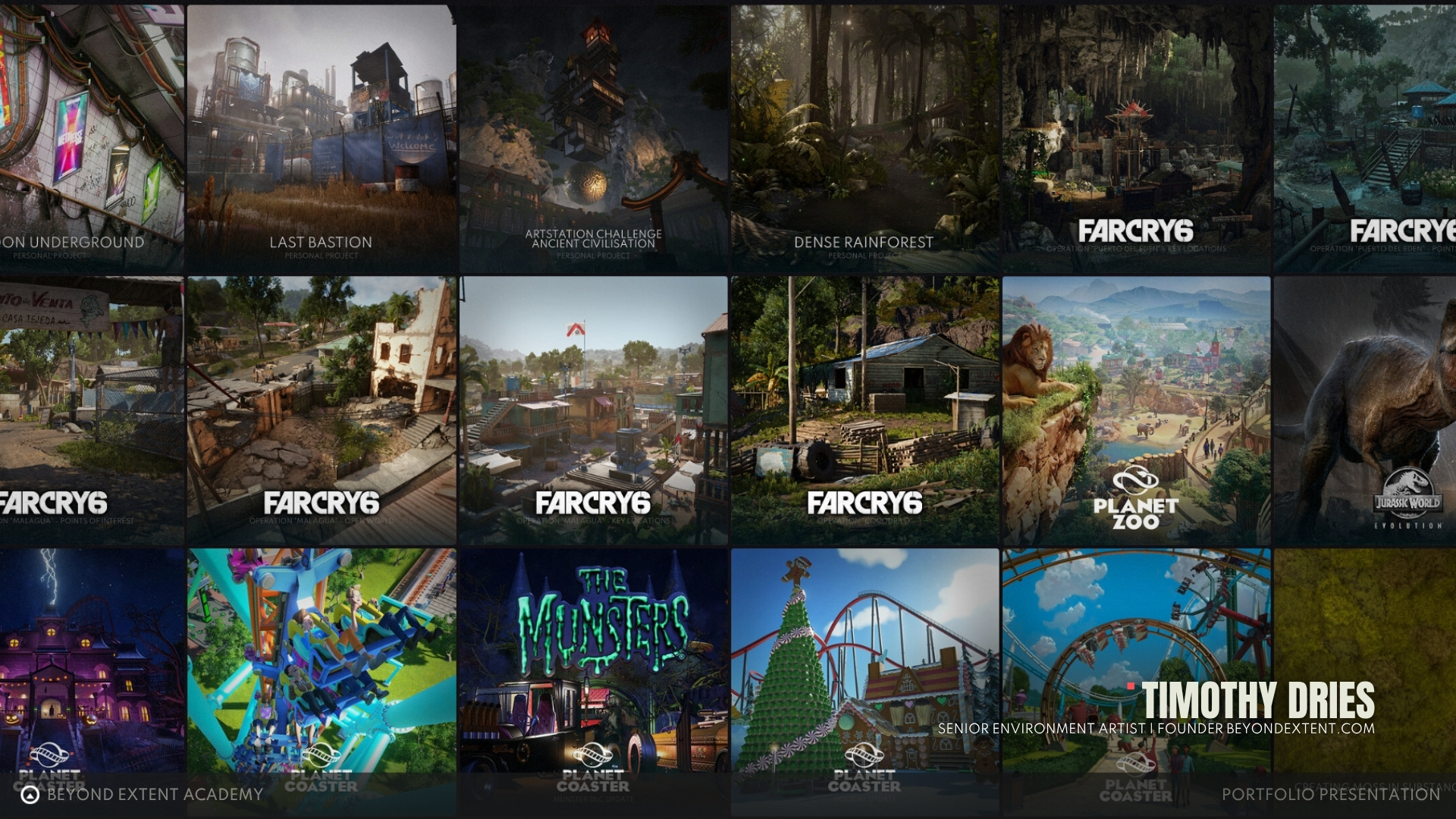
Examples of well designed thumbnails
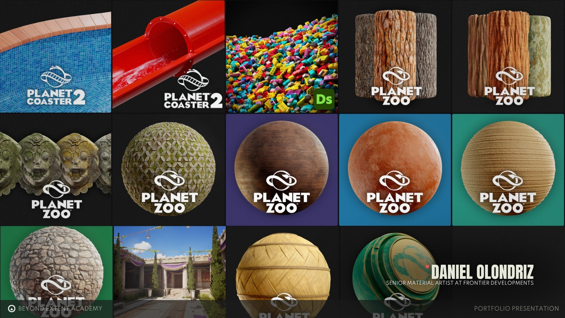
Artwork Design
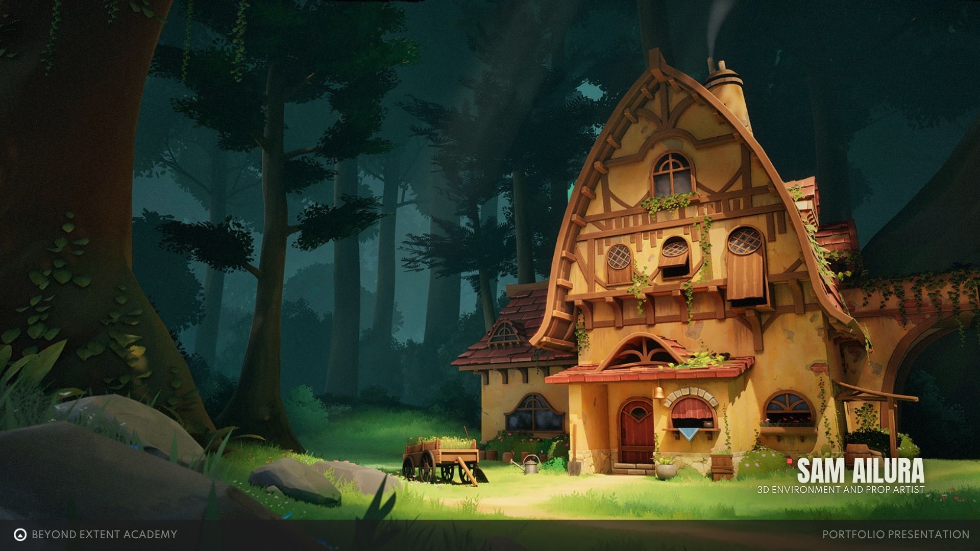
It's time to dive into the artwork itself once people have clicked on our beautiful thumnbnail we want to be able to wow them with the full screen
For this, the general layout will usually follow the same core section, going from most artistical (Beauty Render and Details Shots) to technical (Asset, Material, Lighting Breakdowns and progression GIF's).
Meaning that we put the beautful interesting stuff first, because that is what is interesting to most people and then we put the more technical interesting elements later, because that's for the game art nerds.
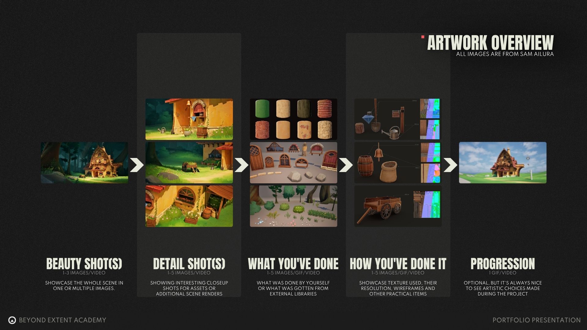
Please visit the following page if you want to CREATE A PORTFOLIO BREAKDOWN
So with knowing the general layout for your artwork we can now focus on some general tips on what we can do to present your artwork better and what we can do to improve the look and feel of our images.
These are in addition to the general advice given above, so if you missed that start there.
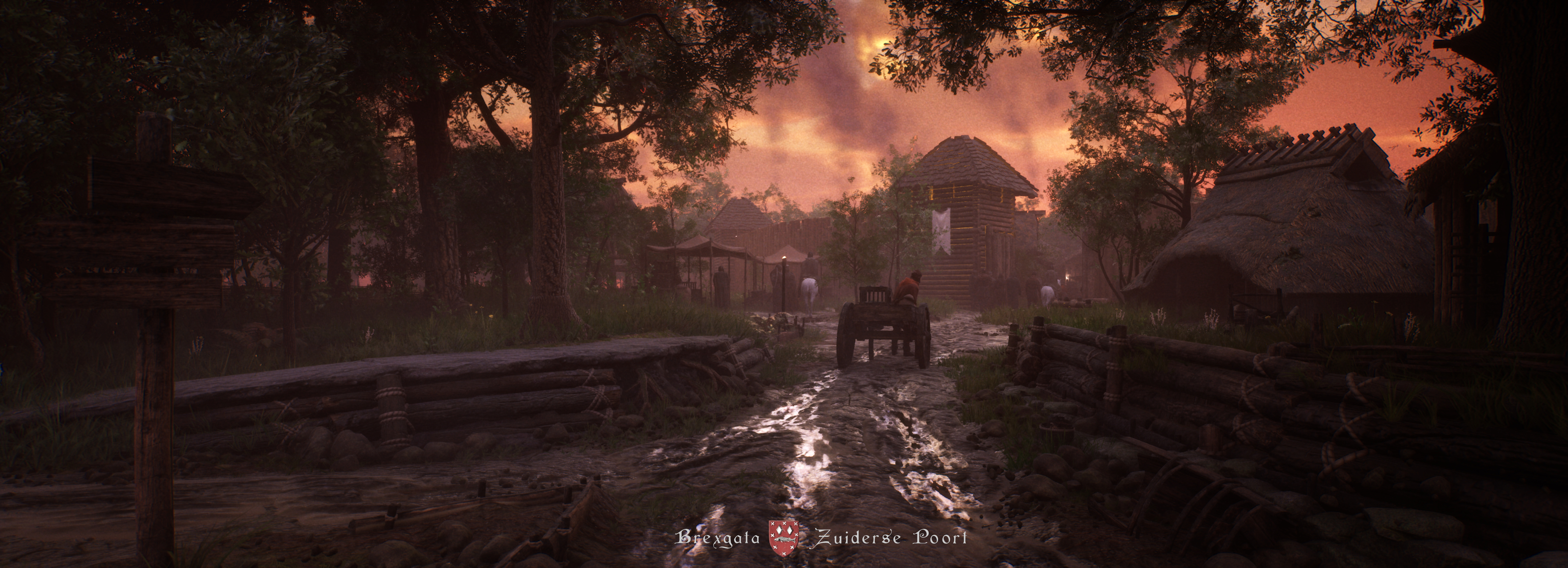
- Use Cinematic Aspect Ratio's
- Add Black Bar
- Attach Name/Contact information
(Each image should contain at least your name, but recommend to add a contact email too) - Personalize your overlay/presentation
(Come up with a project logo, etc...) - Add a custom border
(Adding a special frame/border around your image can be a nice way to personalise your presentation) - Personal Logo (Optional)
(A personal brand/logo can be a great way to make your work more recognisable if applied consistantly) - Project Logo (optional)
(Can be a nice way to makeyour work feel more professional and established, since you are thinking not only on the final image, but also other additional elements too)
Creating a presentation for your art
Here's an example of a layout that is generic enough so it might work for all artworks.
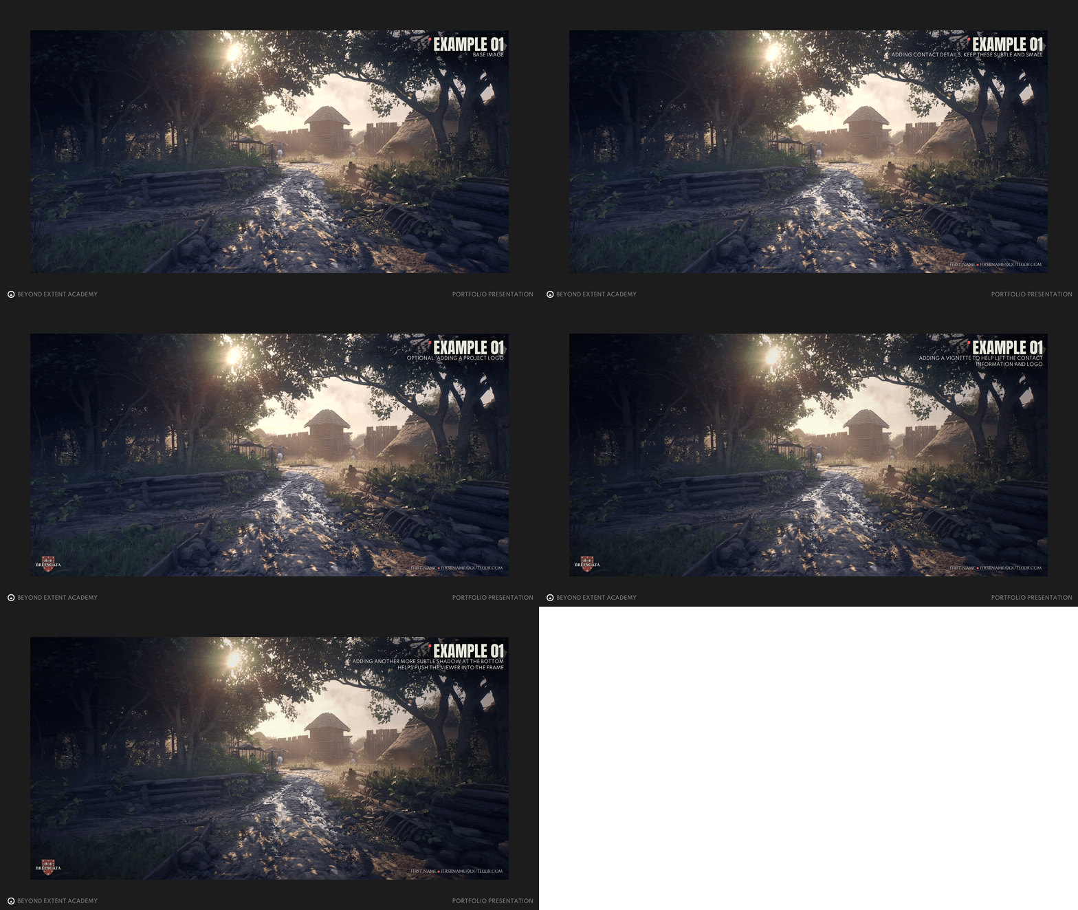
Another example for a project without a project logo
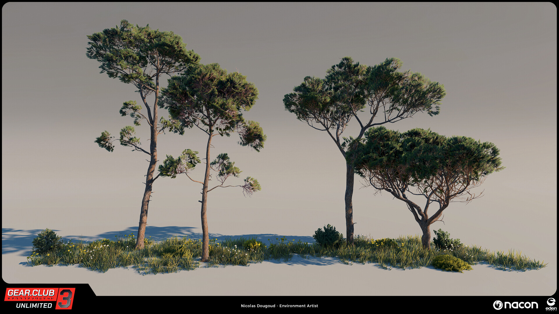
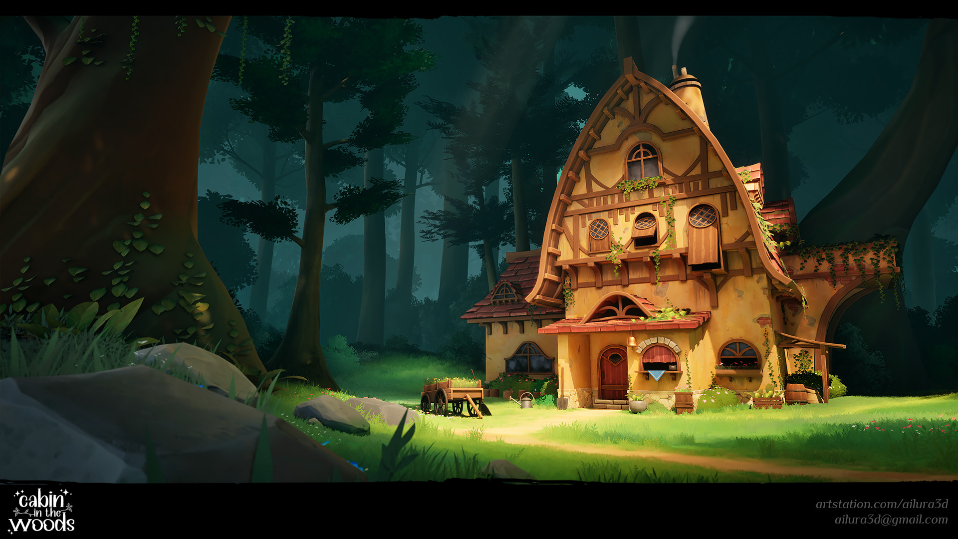
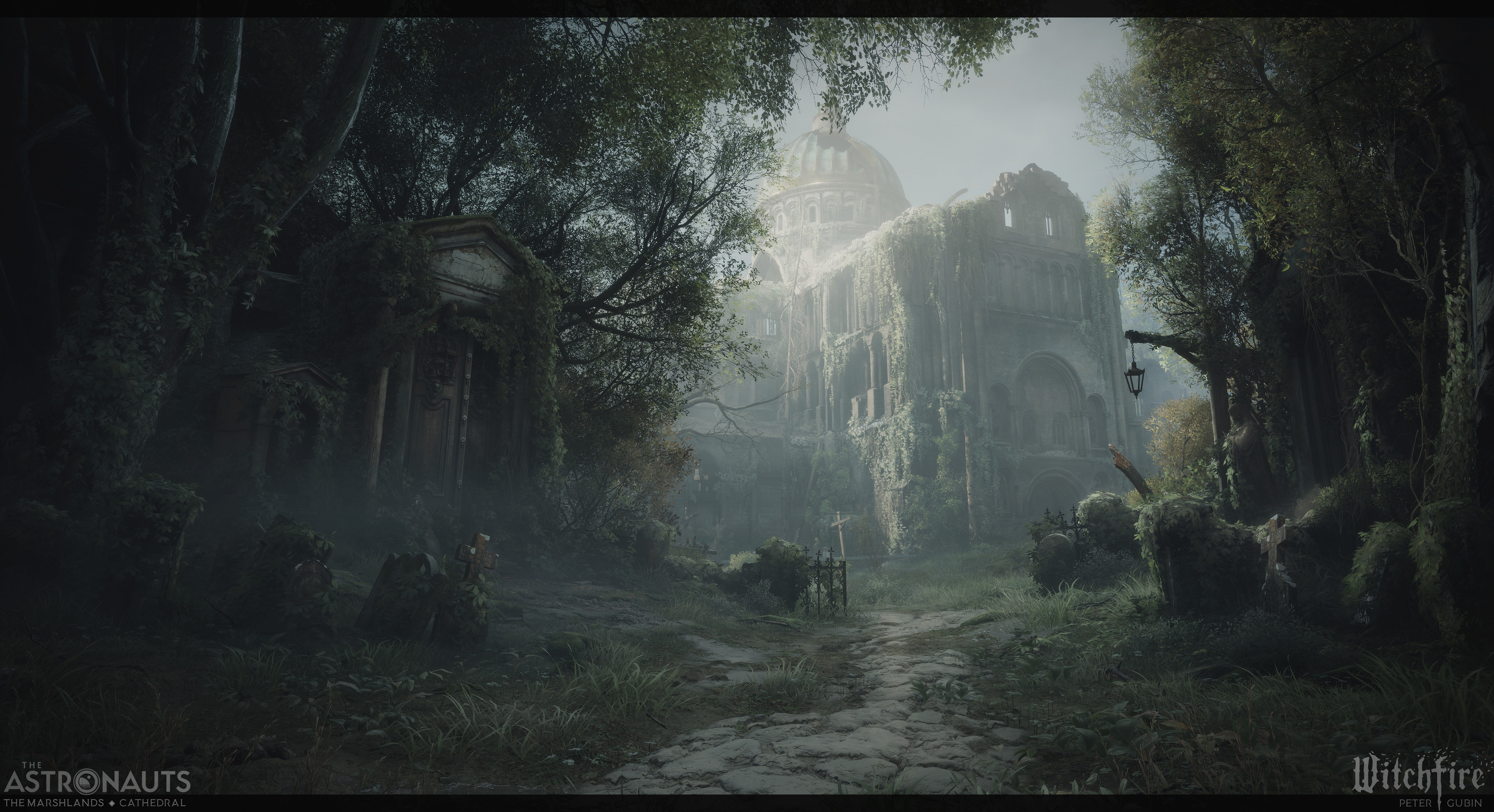
Some examples of great artwork presentations
(Add missing portfolio links to all images)


Frequently asked questions
When do we split into multiple posts?
A common question that gets asked, my general response to this usually is that in a lot of cases
How many images should I add per post?
Placeholder
Additional notes:
Showcase what you've done versus what you have downloaded from a third party store
State whenever you have done a tutorial, we know what tutorials are out there
When you're doing team projects state what you've done yourself clearly, and share your responsibilities
RESOURCES
⚠️
MISSING RESOURCES